Conceptual Design + Models
Before we can present and sell products to our clients and users, we must collectively understand them ourselves. This is easier said than done. When I first arrived at this newly developed product company to establish a design team, they were transitioning from services to products and there was some confusion about what we did and how all the different applications, platforms, technologies, and products worked together.
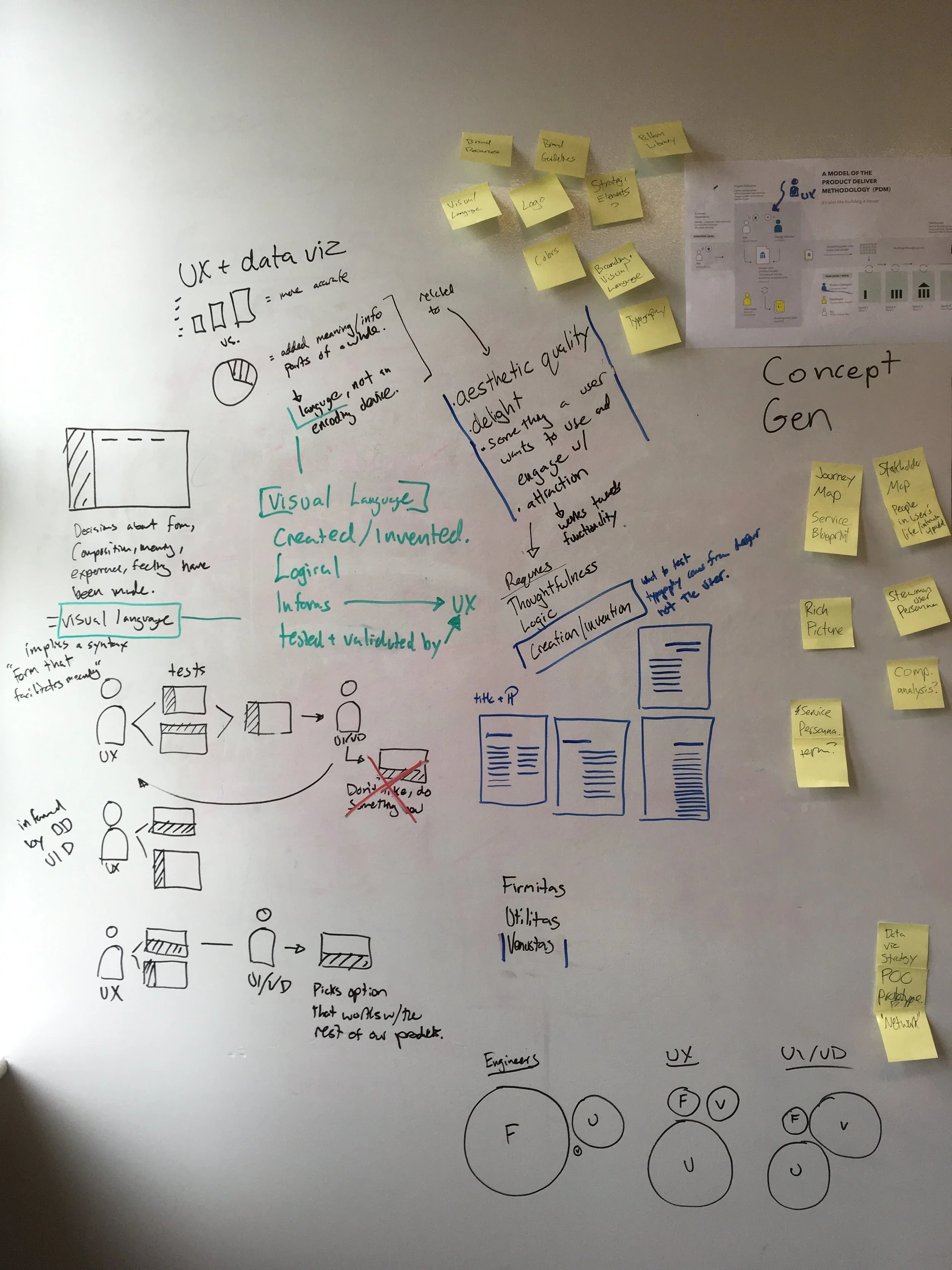
To address this, with the help of our new Chief Product Officer, we created a simple statement and model of what we did as a company and hung them up as posters around the office. This created an accessible shared representation of the company that we could reference and reflect upon. The intention was to facilitate conversation so we could work towards an agreed-upon model.
The posters sparked a conversation amongst the executive team who decided on a definitive statement of what the company did. To emphasis this refinement from conversation, we replaced all the posters with the ones on the bottom-right. Because of these posters, we now had a common way to understand and talk about the company.


MODELING PROCESS
Models can help us understand what we’re trying to build; they can also help us understand a process. Working with the product management team, I sketched and put together models of how agile development would fit into the larger product development process and how different roles interact with one another. Some of these sketches and the product development model are below.

Product Ecosystem
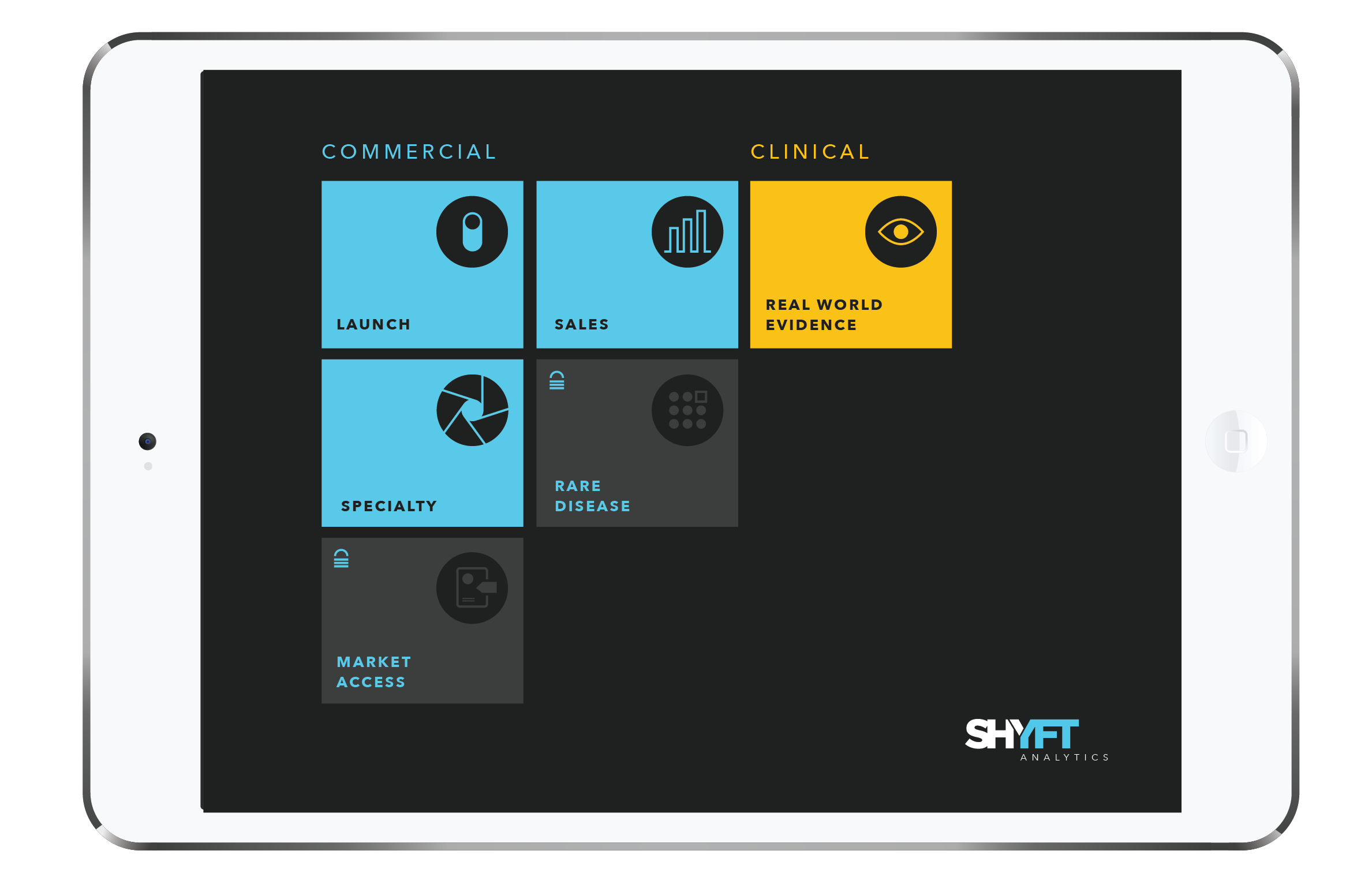
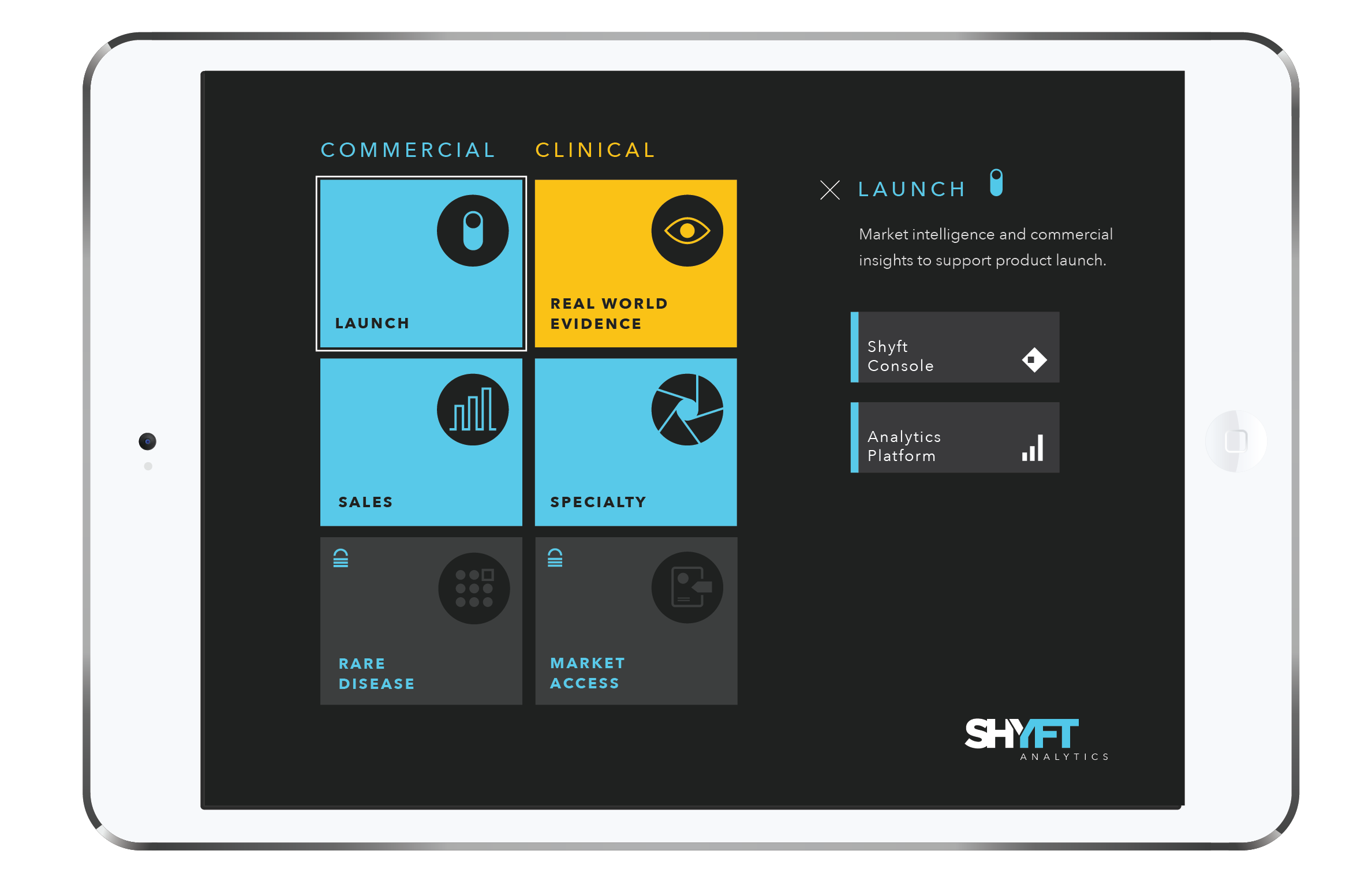
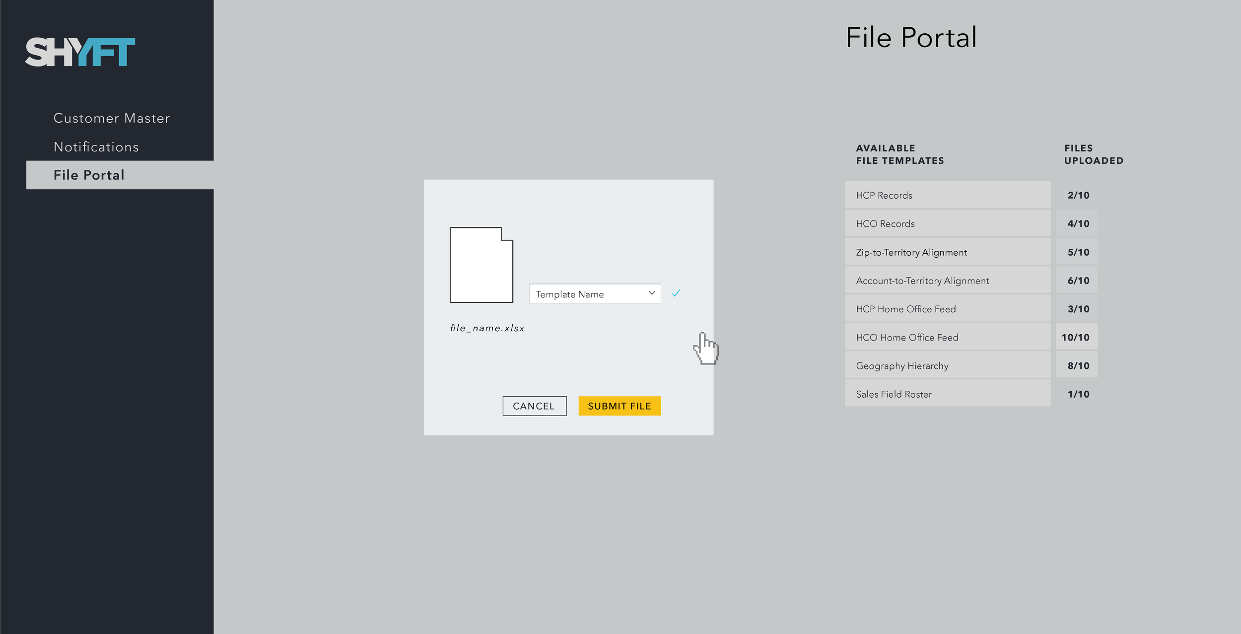
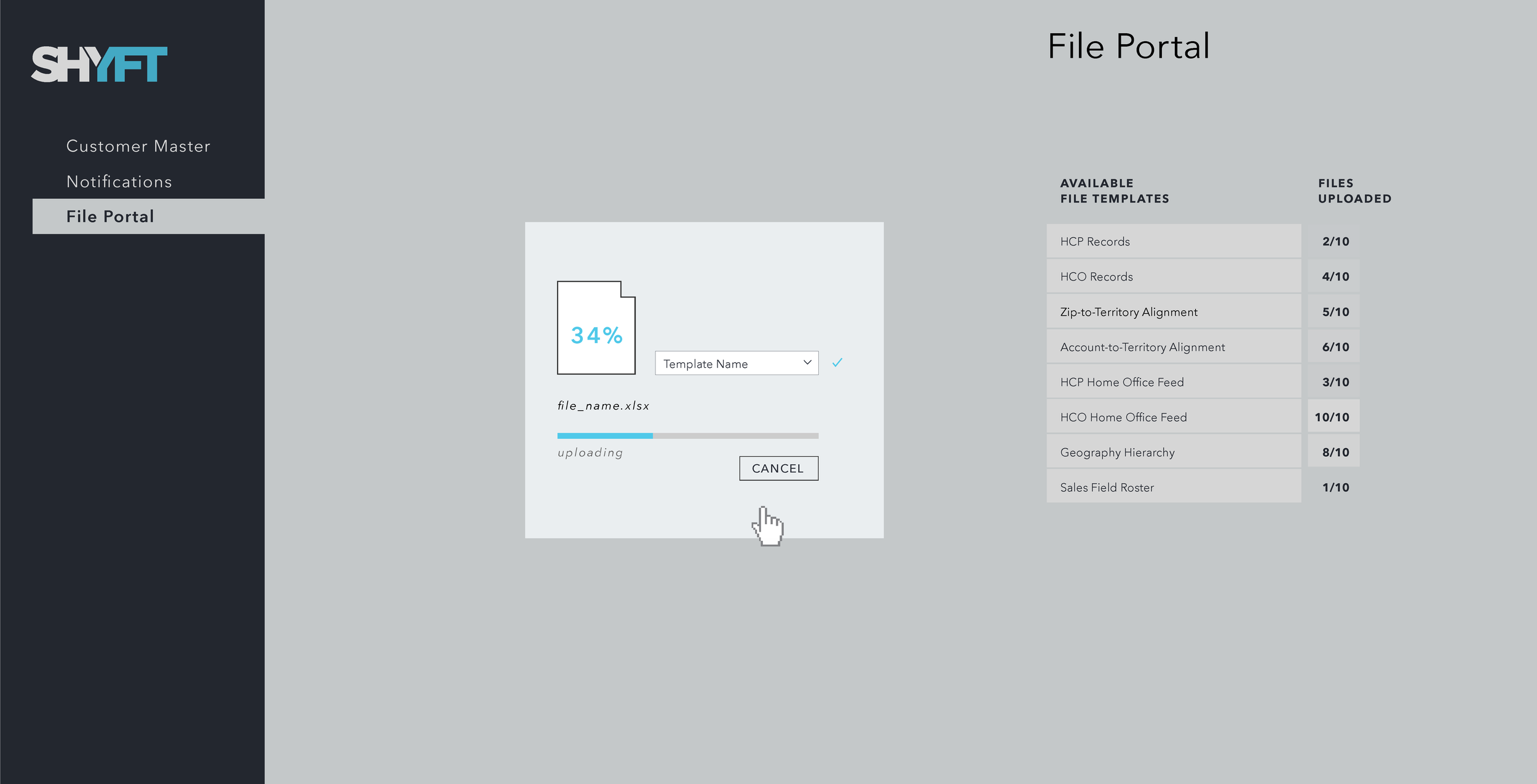
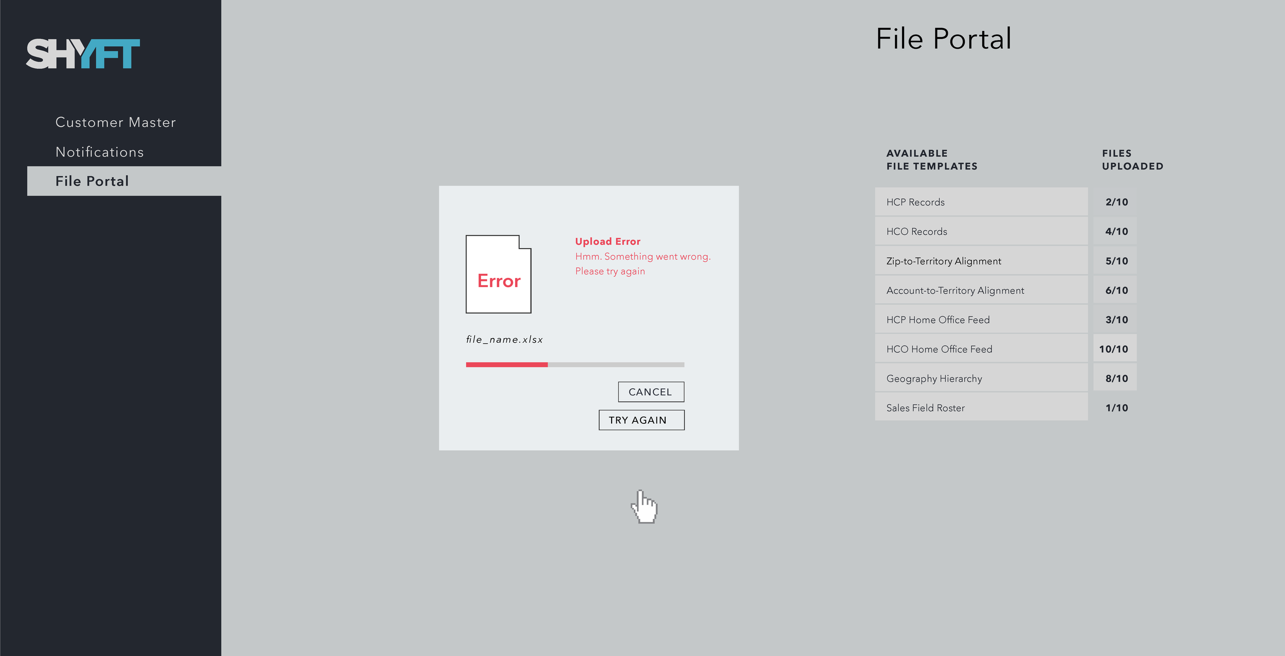
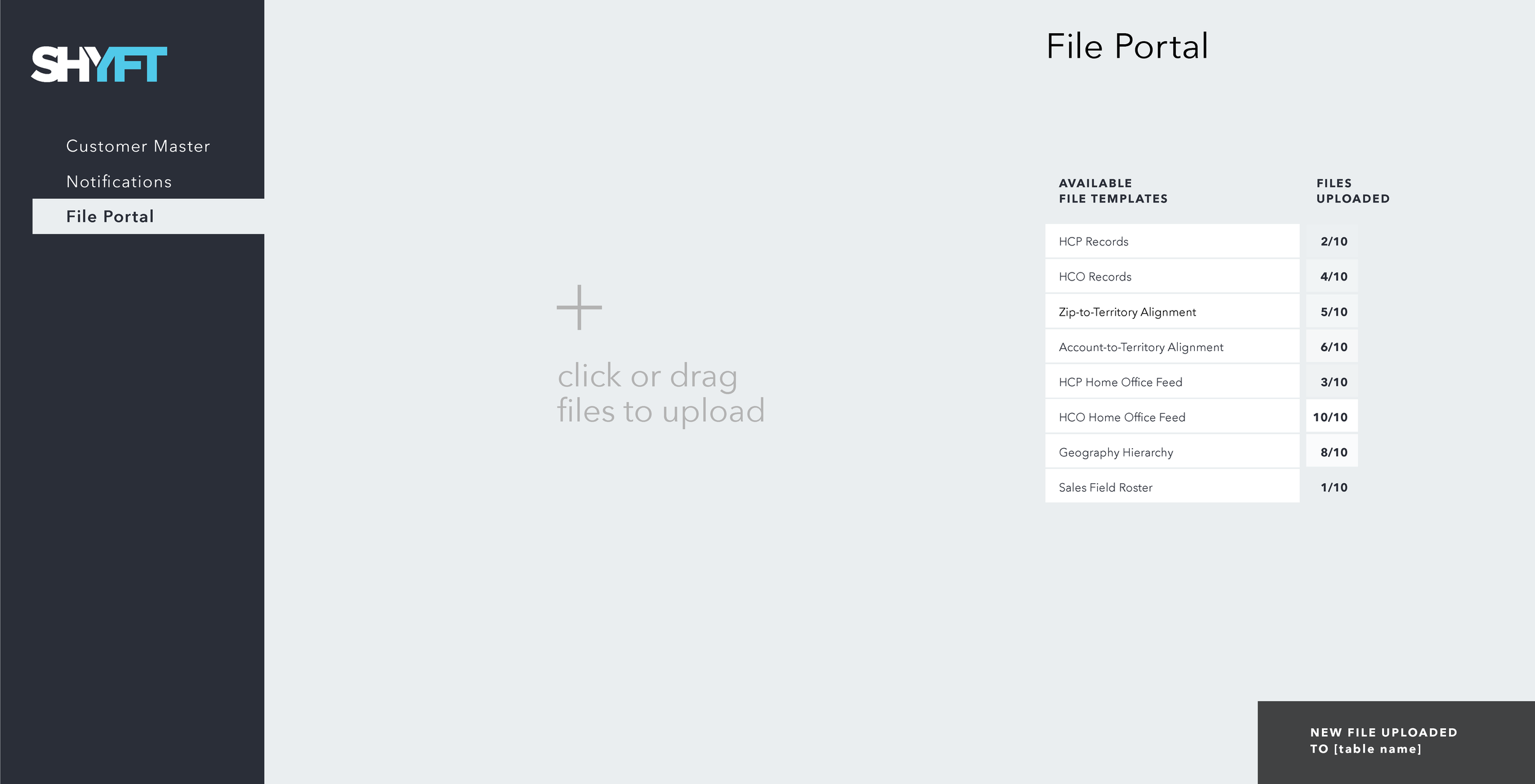
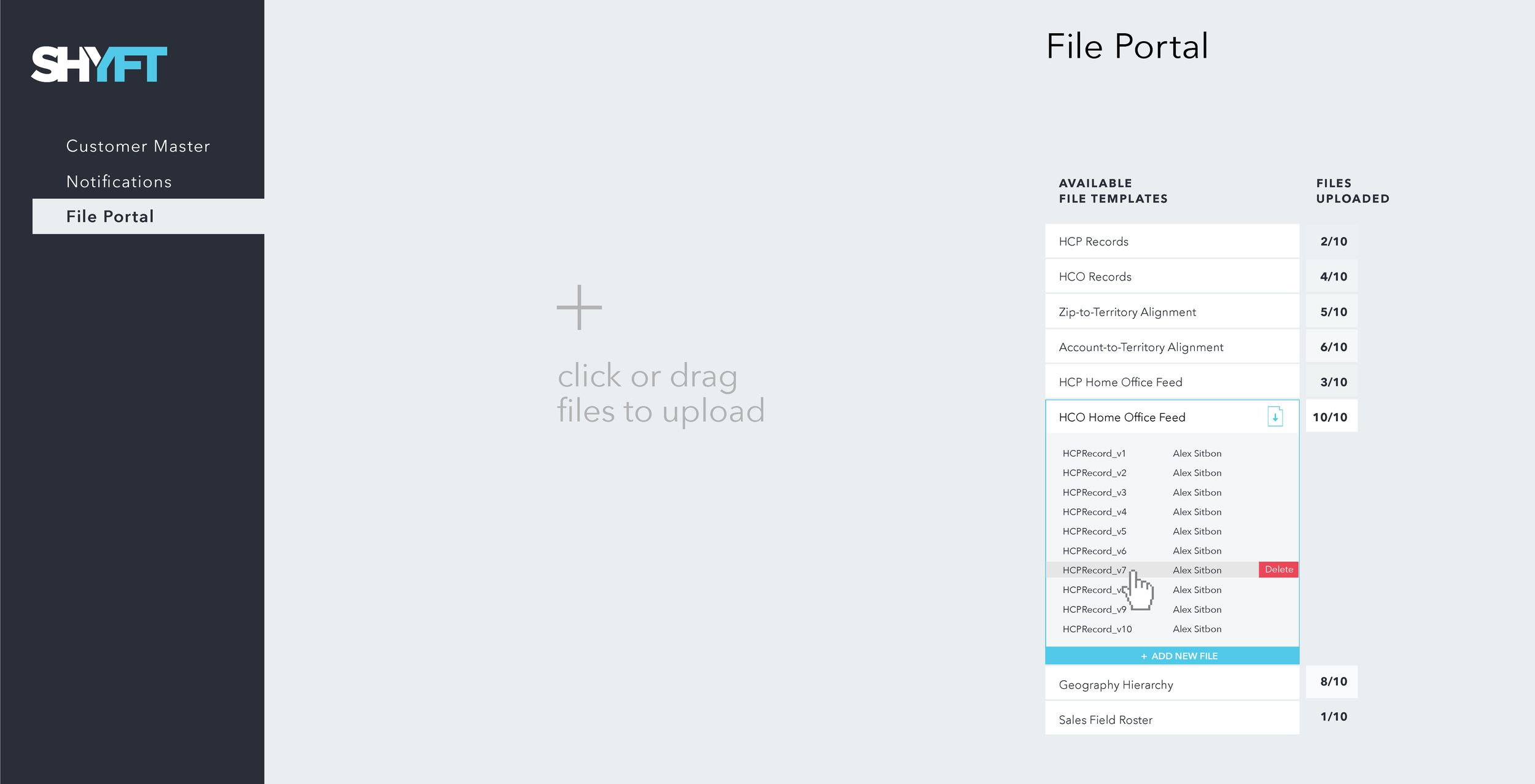
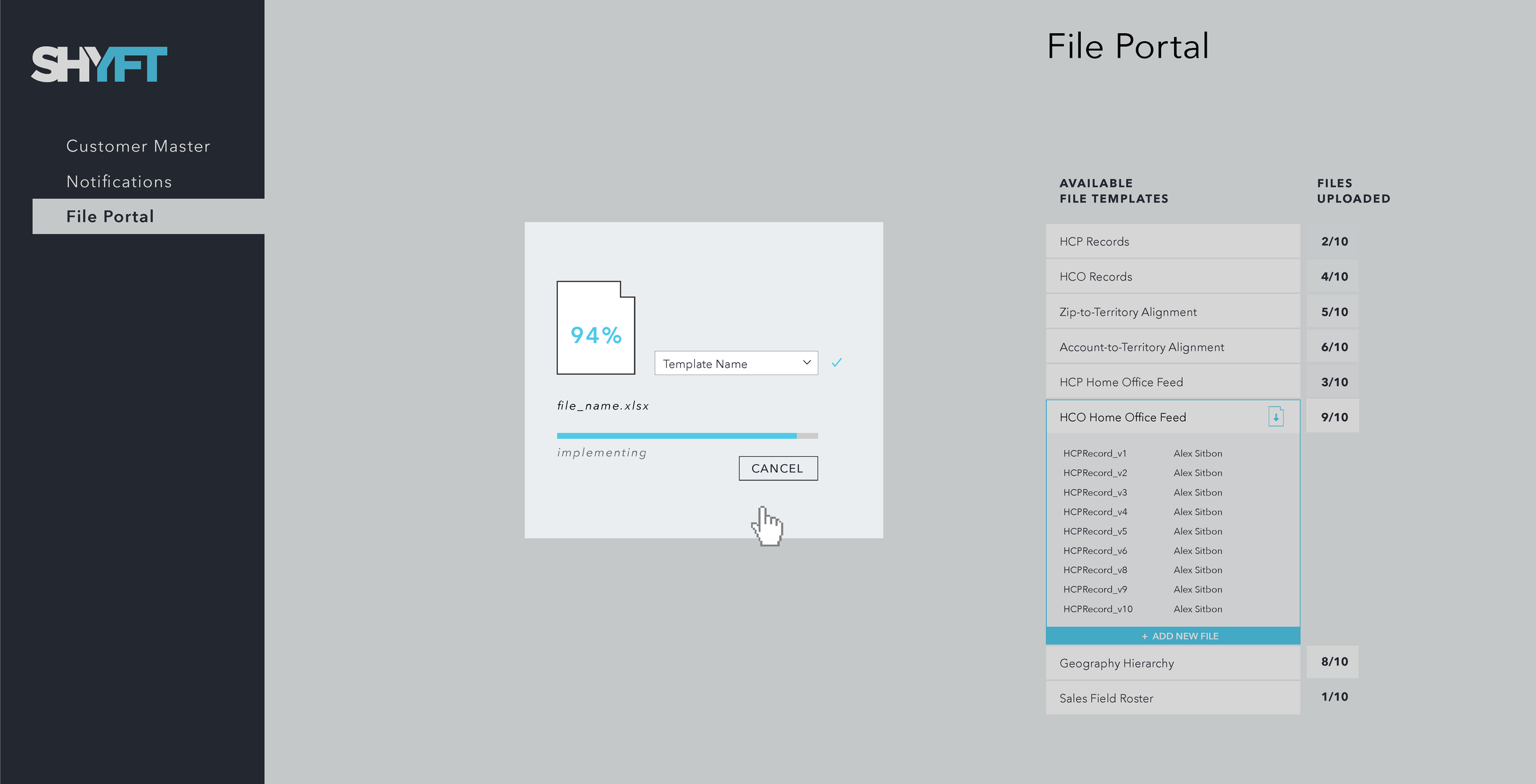
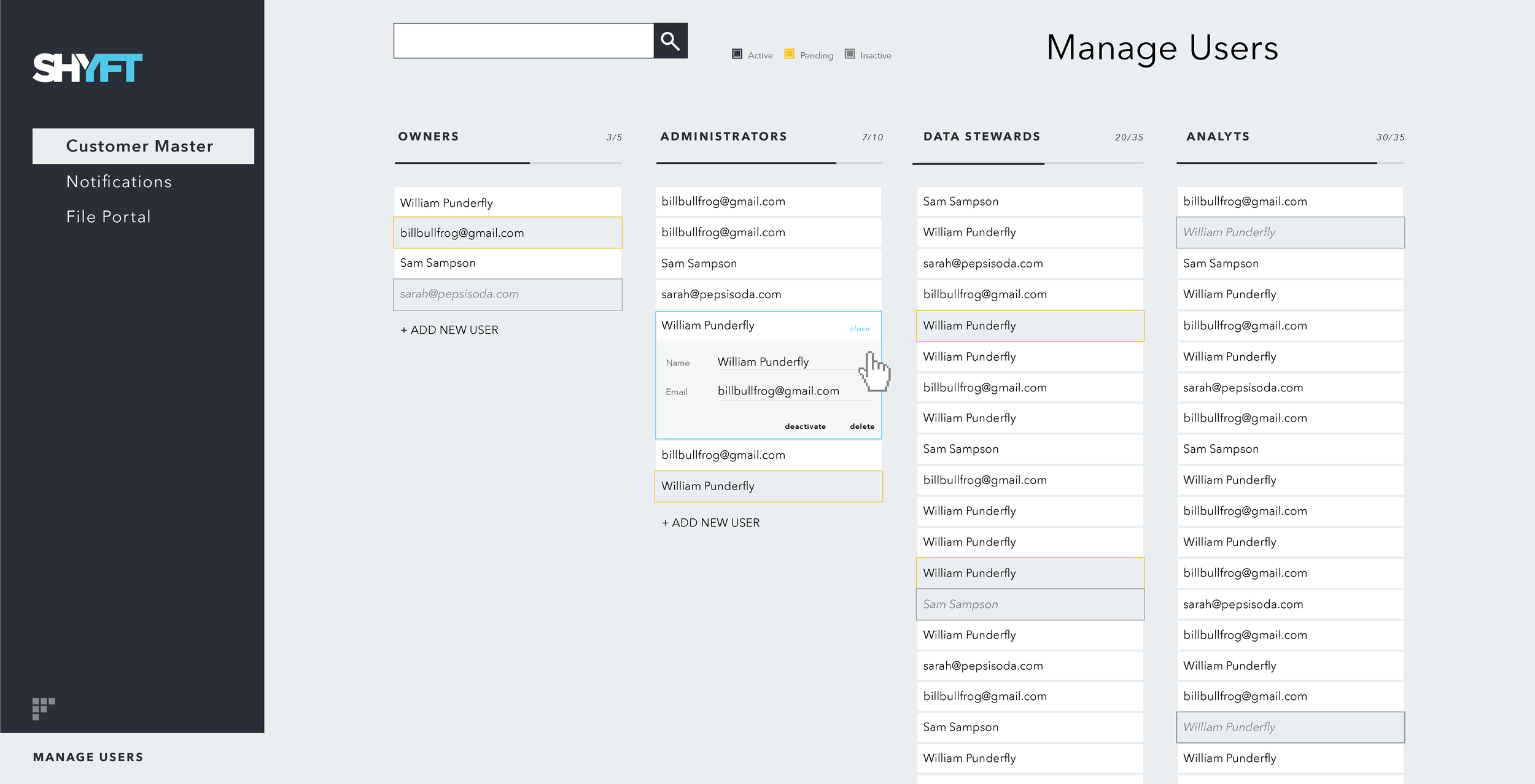
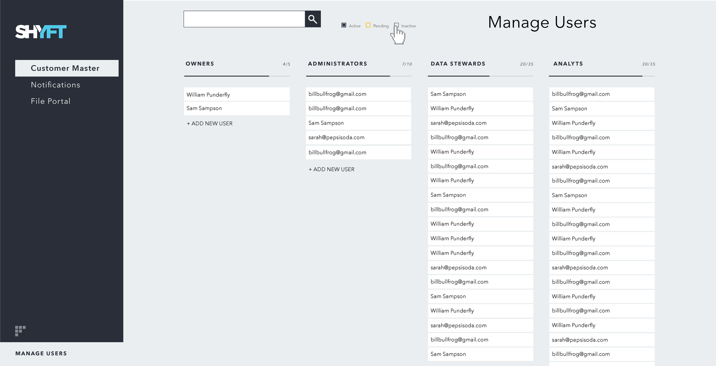
Building off the established model, we then created a “landing page” or “portal” where all of the solutions — and the products within them — would be accessible to sales representatives and our clients.


Interface Design
Several of the product applications were being rebuilt or built for the first time. One of them was the data platform application (see below). Because this application was being constructed from scratch, I used these interface designs to establish a new visual language and logic across products that would eventually become the company's branding.


visualization Design
Our visualization strategy focused on the transformation and reorganization of simple, metaphorical forms. Instead of interacting with the navigation to switch between different charts, this approach focused on interaction with the data itself — or the forms representing the data. Instead of looking at pictures of an object, this approach would be like holding the object itself.


The example on the right transforms from a single stacked bar chart, showing composition of the market, to a trend analysis over time. This is done in two steps, adding the concepts of time, then reorganizing each area into it’s own separate environment.


SANKEY / FLOW DIAGRAM
This diagram builds off the simple bar form. Each stage is just a stacked bar visualizing the composition of that stage. The flows between them is a layer that can be added once the previous forms are understood.


SKETCHES / EXPERIMENTS
These early sketches looked at one particular type of data and how normalizing, reorganizing, and sorting this data can create multiple states and forms of the same visualization. See right blue chart below.


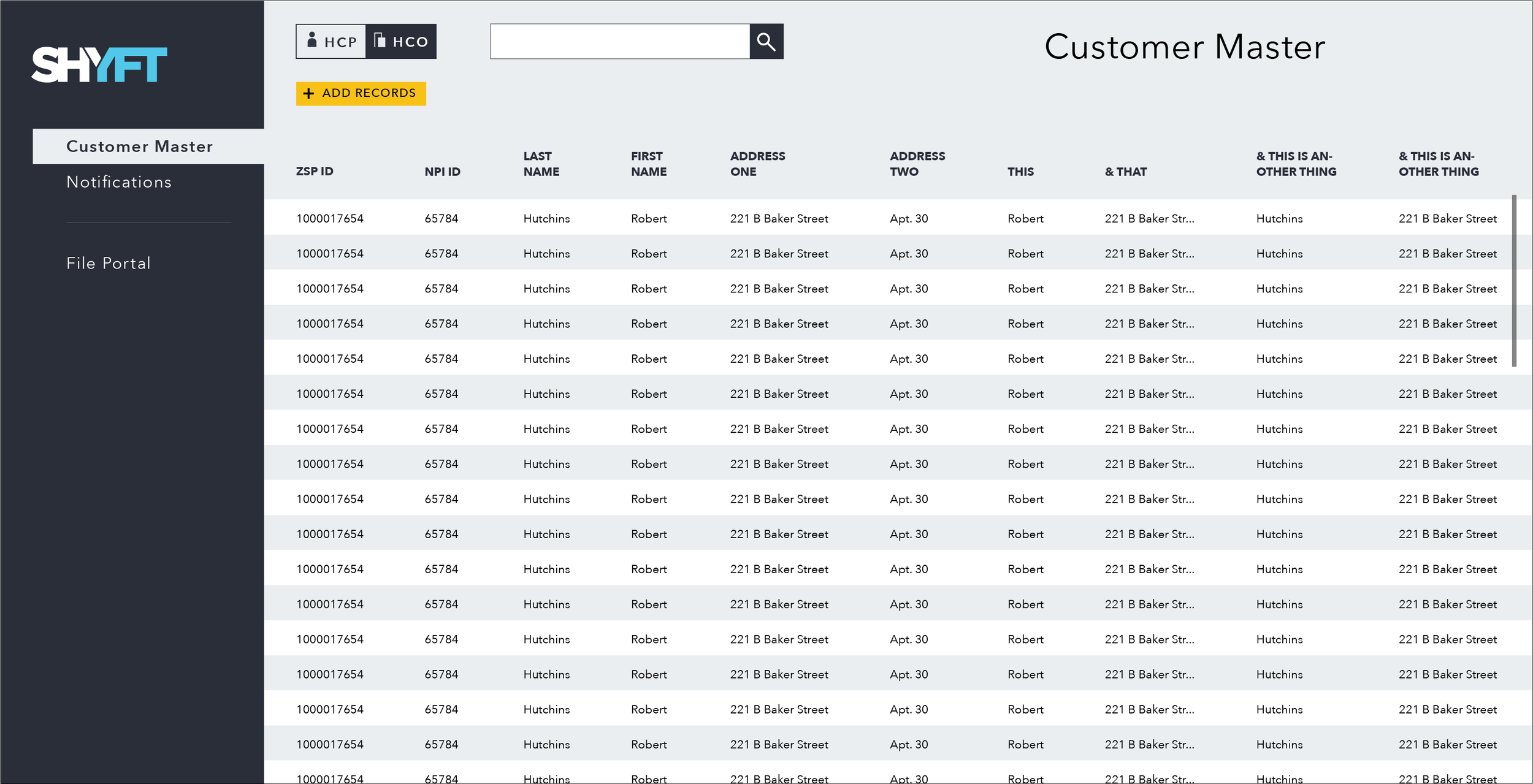
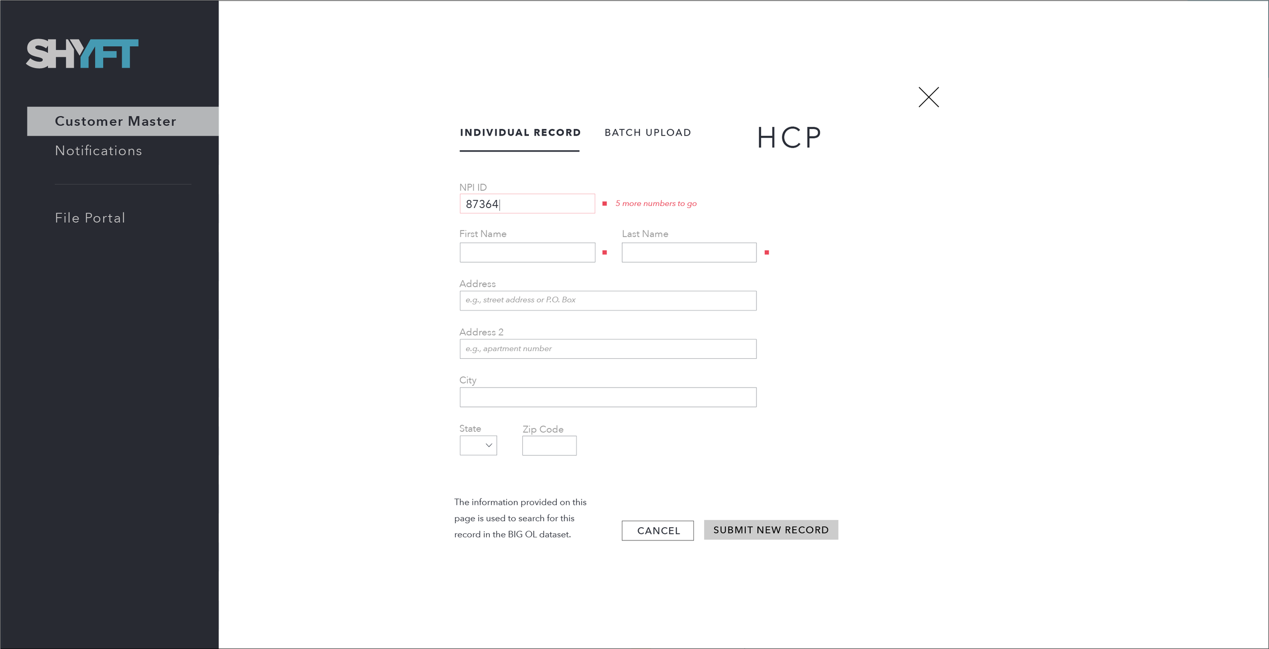
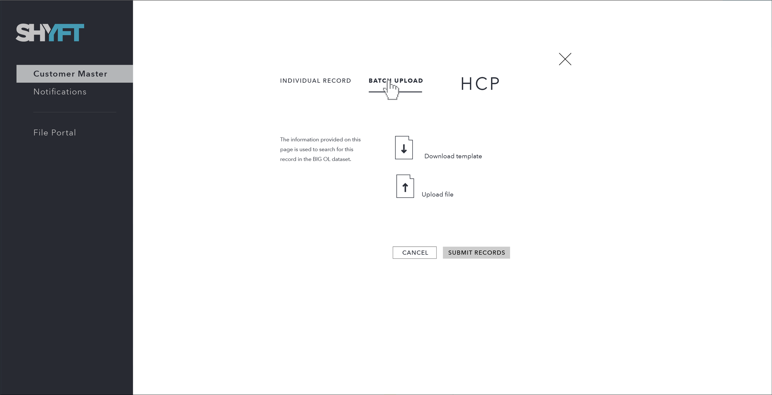
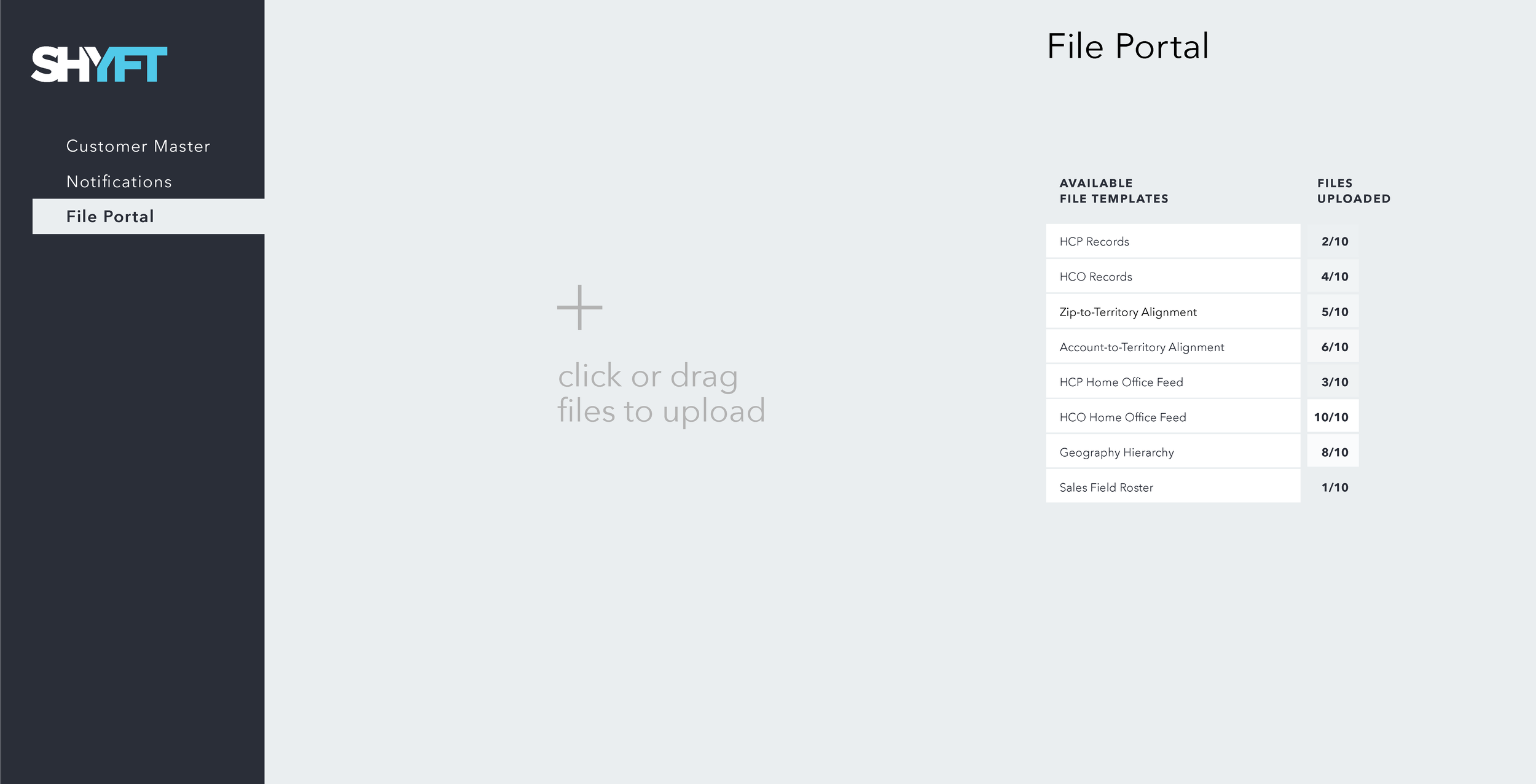
designing a new kind of sales tool
My role: Principle Designer
Team members: 3 engineers, a PO, and the CPO
In a two-month span, we put together a fully functional proof of concept to present to our CEO. We wanted to rebuild an existing application from the ground up, instead of building on top if what we had, so we put together this POC to showcase what a more user-centered application — with a coherent visualization strategy — would look like. I outlined the project in four design phases: Discovery, Definition, Ideation, and Build.
Discovery
One of our product owners was familiar with the users we wanted to build this for and since we were unable to talk to them ourselves, given the short turn-around time, we used the product owner as a proxy user. This phase involved extracting as much information as we could from our PO. Out of this we learned that the three most important questions a sales rep asks are:
Where’s my opportunity?
How am I doing?
What can I do about it?
Definition
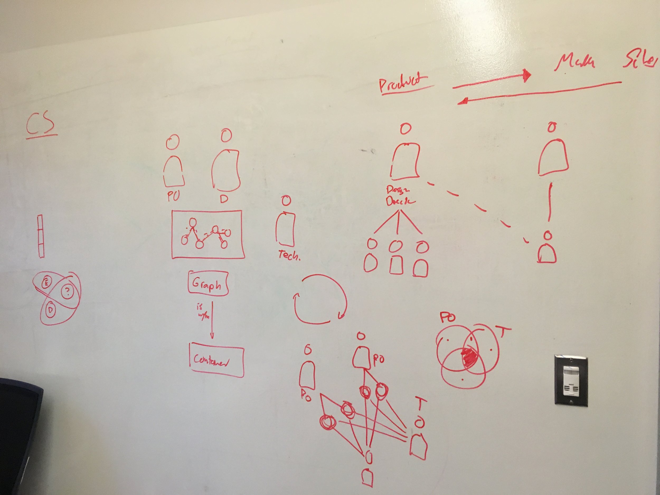
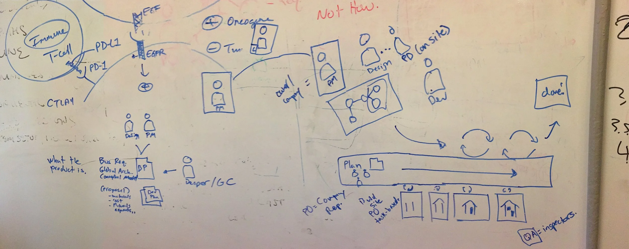
After learning about these sales reps, we began to define a specific workflow (whiteboards sketches on right) that outlined information needs, functionality requirements, and hardware needs at different stages.
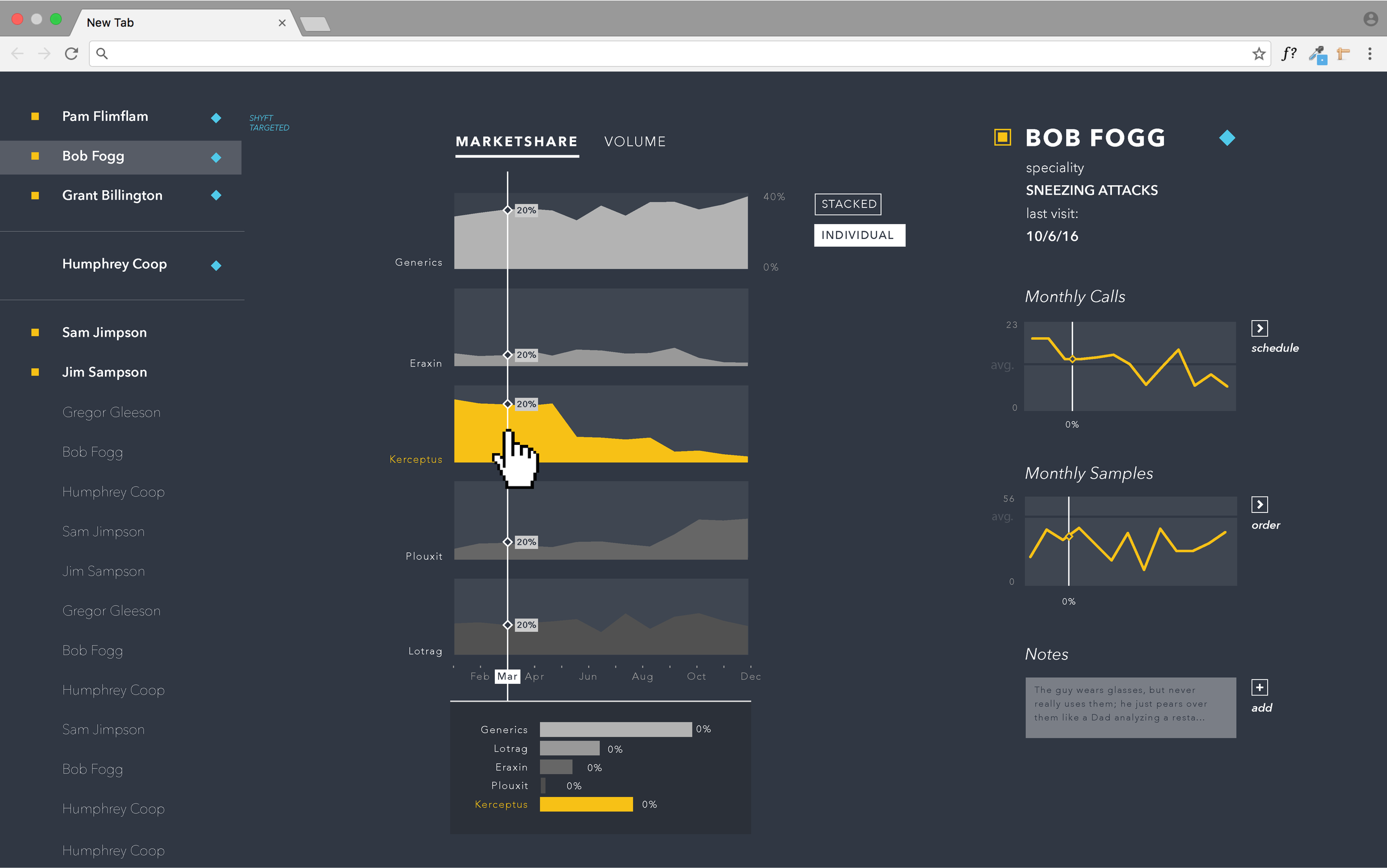
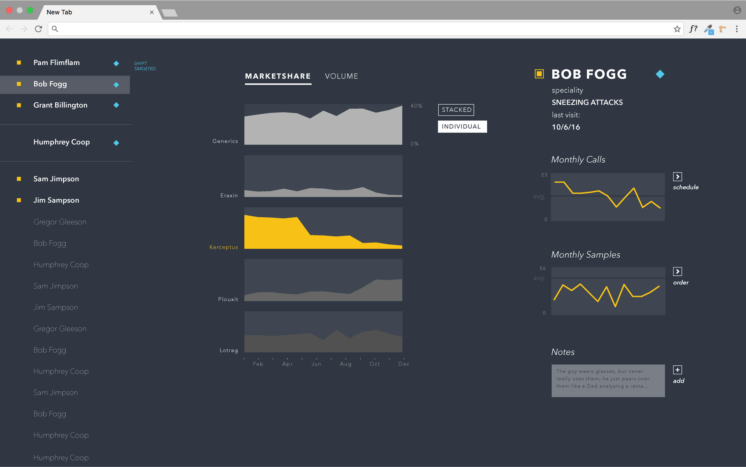
These traveling sales reps are planning their week on a desktop / laptop where they want to explore each prescriber’s history with the drugs being sold, how it compares to competitors, and how that can be understood in terms of overall volume and marketshare. They also want to be able to schedule appointments, order more samples for a prescriber, save specific prescribers of interest, and leave notes to themselves that they can reference during the week. Then during the week, they use their phones to reference their notes, get directions to the prescriber’s office, or refresh themselves on the data.
Ideation
The ideation phase was quick; it involved relatively high fidelity mock-ups and lots of visualization sketches — both static and in code, like the examples outlined in the section above (and repeated on the right). I wanted to make sure we were both meeting the requirements of the user stories and connecting everything with this new visualization strategy.
Build
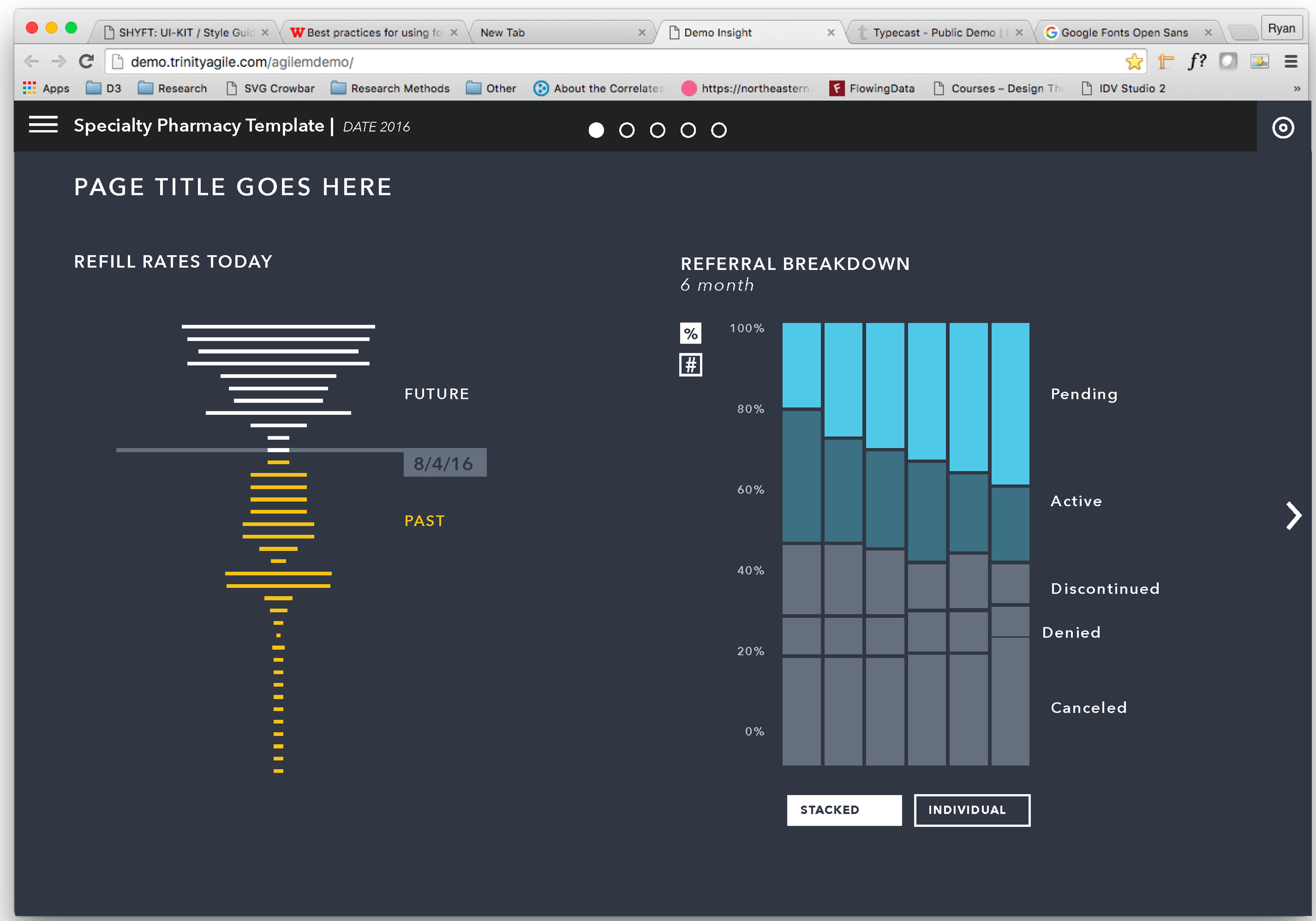
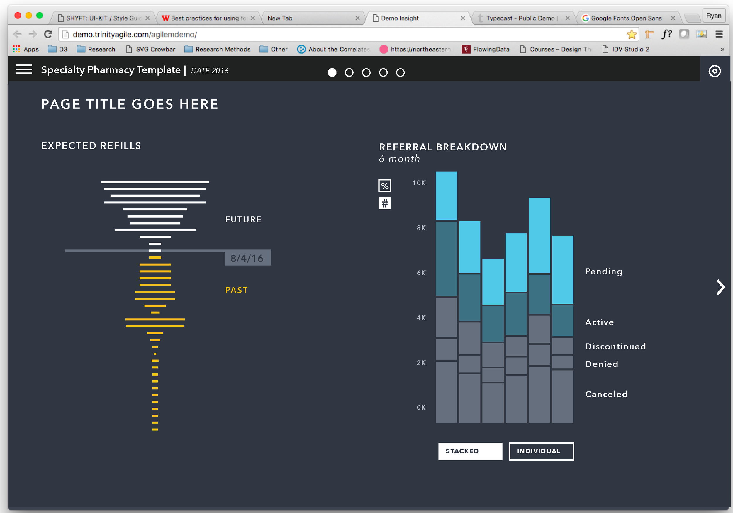
The build phase involved rapid development with three engineers over the course of two, two-week sprints. During this phase, I was sitting with each of them walking through expected behavior, interactions and performance. Screenshots from the final visualization are in the monitor below; the original mock-ups are below that — including the mobile version.
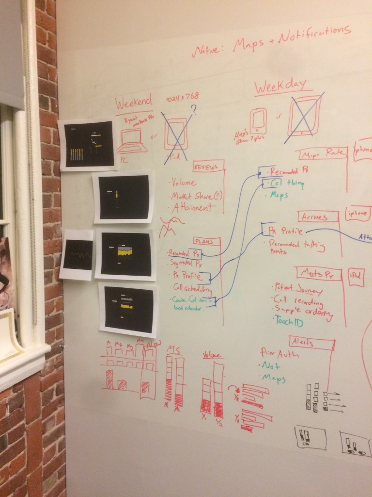
Whiteboard session with PO and CPO, defining workflow of these traveling sales reps
Our transforming-visualization strategy involved complex forms that are constructed slowly as new concepts are applied. In this simple example, a stacked bar chart becomes something like a waterfall chart as the concept of time is applied.